Case study
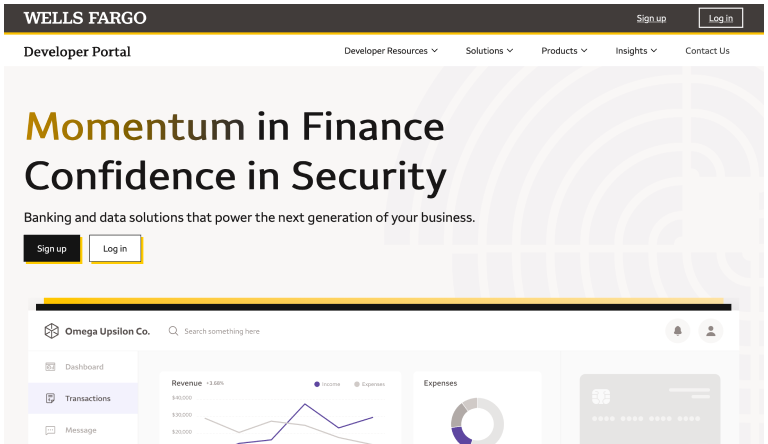
Developer Portal
Wells Fargo’s master brand is iconic—but not built for developers.
The Challenge
The Developer Portal needed to:
- Feel credible within Wells Fargo’s enterprise ecosystem
- Attract and retain a technology-first fintech audience
- Differentiate from retail and commercial banking experiences
- Signal innovation without breaking brand trust
At the same time, we had to avoid fragmenting the brand or creating “another siloed identity.”
The Problem
We were designing for two opposing forces:
- Enterprise consistency → strict adherence to Wells Fargo brand guidelines
- Developer expectations → modern, fast, technical, and inspiring
Leaning too far either way meant failure:
- Too “banking” → outdated, low credibility with developers
- Too “startup” → loss of trust and brand cohesion
Approach
I led the definition of a visual identity system grounded in design attributes, not just colors or UI.
1. Align on Emotional North Star
We reframed the user as:
“A rockstar builder—someone creating meaningful financial products.”
This unlocked three core attributes:
- Inspired
- Confident
- Empowered
These became the foundation for every visual decision.
2. Reinterpret the Brand (Not Replace It)
We explored multiple color strategies:
- Pure enterprise (Wells Fargo red/yellow dominant) → too traditional
- Hybrid systems → transitional but inconsistent
- Graphite-forward palettes → modern, technical, scalable
Final direction:
- Anchor in graphite/dark UI for a technical feel
- Use Wells Fargo yellow + red as accents (not foundations)
- Introduce indigo/blue tones to signal innovation and APIs
Result: unmistakably Wells Fargo—but finally developer-native
3. Build a Visual Language System
We translated abstract attributes into tangible design patterns:
Inspired
- Light, energy, motion, networks
- Futuristic gradients and luminous systems
Confident
- Geometry, precision, structure
- Grids, sharp forms, controlled compositions
Empowered
- Scale, nature, force, progression
- Depth, contrast, and directional movement
This ensured consistency across:
- Marketing pages
- Documentation
- API exploration experiences
4. Concept Exploration & Storytelling
We developed multiple visual directions to align stakeholders:
- Waves of Innovation → continuous movement, fintech evolution
- Accelerating Forward → precision, speed, engineering rigor
- Building the Future → modular systems, APIs as building blocks
- Route 1852 → heritage meets modern trajectory
These concepts helped bridge:
- Executive vision
- Brand constraints
- Product reality
Outcome
- Established a cohesive visual identity system for Developer Portal
- Successfully aligned stakeholders across design, brand, and leadership
-
Delivered a direction that:
- Feels modern and technical
- Maintains enterprise trust
- Scales across platform and marketing surfaces
Impact
- Elevated perception of Wells Fargo as a credible fintech platform
- Created a foundation for future API and developer experiences
- Reduced fragmentation by aligning to master brand through reinterpretation—not deviation